Bad landing pages waste ad spend. Good ones turn clicks into sales. In this guide we walk you through every step you need to build a landing page design that converts customers. You’ll see how to set a clear goal, craft a magnetic headline, write copy that hits pain points, add proof that builds trust, and finish with a CTA that closes the deal. Let’s get started.
Step 1: Define Your Conversion Goal
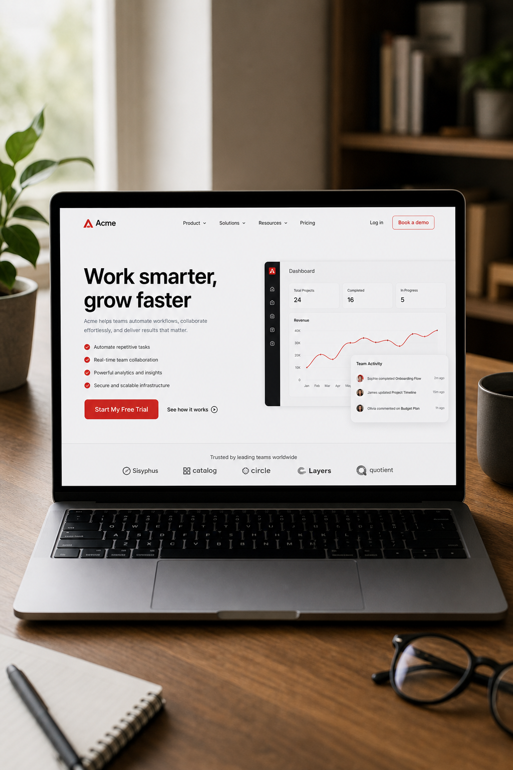
First, decide what you want the page to do. A page that asks for an email needs a different layout than one that sells a product. When the goal is crystal clear, every element can be built to support it.
Here’s how we break it down:
Pick a single, measurable action , download, sign‑up, purchase, or book.
Assign a target conversion rate so you can measure success.
Map the visitor journey from ad click to the final button.
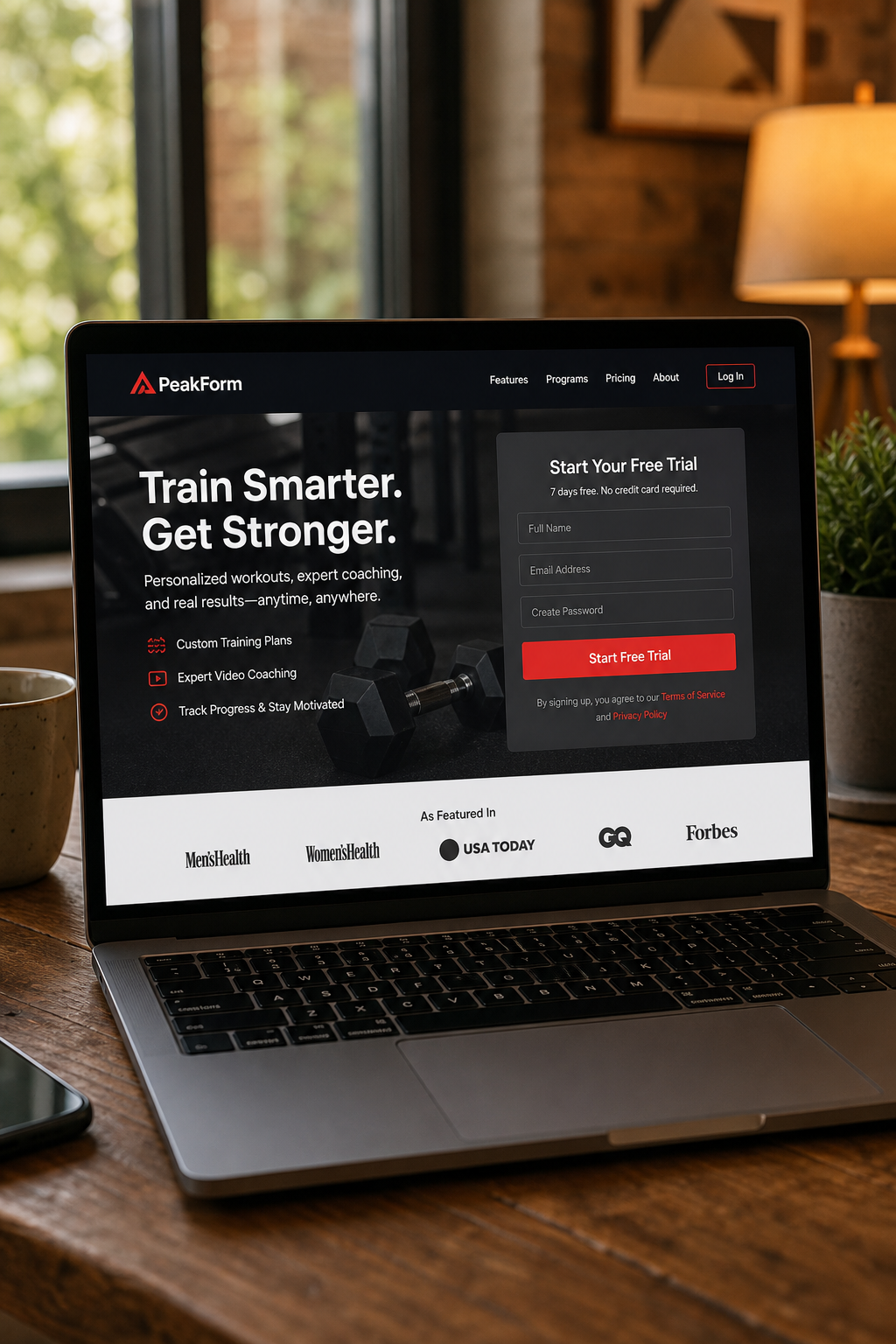
Imagine you run a SaaS trial campaign. Your goal is a free‑trial sign‑up. That means the form should ask for only name and email, and the button should say something like “Start My Free Trial.” Anything more creates friction.
We often start with a simple worksheet that lists the goal, the metric, and the key messaging. This worksheet lives in a shared online document so the whole team can edit it.
Why does this matter? Because a page with a vague goal ends up with mixed signals , a headline about benefits, a form that asks for a phone number, and a button that says “Learn More.” Visitors get confused and leave.
One of our recent clients, an e‑commerce brand, tried to combine “add to cart” and “join the newsletter” on the same page. After we split the page into two focused goals, their conversion rate jumped from 2.1% to 4.7% , almost a 125% lift.
Keep the goal front‑and‑center. Write it on a sticky note and place it on your screen while you design.
Key Takeaway: A single, specific conversion goal guides every design decision and prevents mixed signals.
For agencies that need tight alignment between ads and landing pages, we often recommend using paid search management to ensure the page copy mirrors the ad copy and the CTA matches the keyword intent.
Step 2: Craft a Compelling Headline and Subheadline
The headline is the first thing a visitor reads. It must tell them they are in the right place and spark curiosity.
Research from industry studies shows that straightforward headlines beat clever ones 88% of the time. A headline that states a clear benefit or solves a problem works best.
We follow a three‑part formula that balances benefit, solution, and hook:
Benefit or pain point , what the visitor cares about.
How you solve it , a quick hint at the method.
The hook , a number, guarantee, or unique angle.
Example for a project‑management tool: “Cut Your Planning Time in Half , Try Our Free 14‑Day Trial.” The benefit (cut time), the solution (our tool), and the hook (free 14‑day trial) are all present.
Write a few variants and test them with A/B testing tools or a quick poll among teammates. The winning headline should also match the ad copy. If your ad promised “Fast Quotes for Roof Repairs,” the landing page headline should echo that promise.
Don’t forget the subheadline. It expands the headline in one or two short sentences, adding a bit more detail without overwhelming the reader.
Here’s a quick checklist for headlines and subheadlines:
Use simple, plain words. Avoid jargon.
Keep it under 12 words.
Include a numeric value or time frame when possible.
Make sure it aligns with the visitor’s intent.
After you lock the headline, place it above the fold , the area visible without scrolling. That way the visitor sees the promise instantly.
According to industry research, a clear value proposition in the headline can lift conversion rates by several points.
Step 3: Write Persuasive Copy That Speaks to Pain Points
Copy is the engine that moves a visitor from interest to action. It should focus on the visitor’s problem, not on your features.
Start with the value proposition. Ask yourself: What does the visitor gain? What pain disappears?
We use a simple structure:
Identify the pain.
Show empathy , let the reader know you get it.
Present the solution.
Explain the benefit in concrete terms.
For a dental practice, a pain point might be “worried about painful extractions.” The copy could read: “Tired of dreaded dental drills? Our gentle extraction technique reduces discomfort by 70%.” Notice the concrete benefit and the emotional hook.
Keep sentences short. One idea per sentence. Use verbs that start with “you” to keep the focus on the reader.
Here’s a quick template you can copy‑paste:
“You’re frustrated with X because Y.”
“We understand how X can waste time and money.”
“Our solution does Z, so you can enjoy A.”
Make the copy scannable. Use bullet points to list benefits. Highlight the most compelling benefit in bold.
When you write, read the copy aloud. If it sounds like a sales pitch, pull back. Aim for a conversational tone that a friend would use.
Testing matters. Run an A/B test where version A uses a benefits‑first copy and version B leads with features. Measure which version lifts the conversion metric you set in Step 1.
Pro Tip: Include an “even if” clause to defuse objections, e.g., “Get results even if you’ve tried other tools before.”
Step 4: Use Social Proof and Trust Signals
People trust what others have tried. Social proof is the shortcut that helps them decide.
There are many types of proof you can add:
Customer testimonials with photos.
Case studies that show real results.
Client logos of recognizable brands.
Star ratings from third‑party sites.
Industry awards or certifications.
Pick the ones that match your audience. B2B SaaS buyers love case studies; e‑commerce shoppers love star ratings.
One study by conversion optimization experts found that testimonials with photos improve recall by 23% over text‑only quotes. Another experiment by a leading landing page agency showed that adding a client logo raised conversions by 69%.
When you place proof, keep it above the fold if possible, or right next to the CTA. That way the visitor sees the validation before they decide to click.
Here’s a simple layout:
Proof Type
Best Placement
Why It Works
Photo testimonial
Right under headline
Human faces create connection
Case study snippet
Mid‑page, before form
Shows real results
Logo strip
Above CTA
Instant credibility
Don’t overload the page. Pick two or three strong pieces and keep the rest for deeper pages.
Long Weekend adds trust signals such as an accreditation badge and a “30‑day money‑back guarantee” badge. Those signals shave seconds off the decision time.
What is the difference between a landing page and a homepage?
A landing page is built for a single campaign goal, such as collecting emails or selling a product. It removes navigation and extra links that could distract the visitor. A homepage serves many purposes, offers broad information, and often includes a full menu. Because a landing page focuses on one action, it typically converts at a higher rate than a homepage.
How many form fields should I use on a conversion‑focused landing page?
Less is more. For most lead‑gen offers, ask only for name and email. If you need more data, add one extra field like phone number, but each added field can drop conversions by 5‑10%. Test a short form first, then add fields only if the extra information is essential for follow‑up.
Should I use video on my landing page?
Video can boost time on page, which often improves conversion. Industry research shows that landing pages with video see an 86% lift in conversion when the video explains the value proposition. Keep the video under two minutes, place it near the headline, and add a clear CTA right after it.
How important is page load speed for conversions?
Very important. Research shows that 70% of shoppers say a slow page makes them leave. Aim for under three seconds on mobile. Compress images, use lazy loading, and minify CSS/JS. Test speed with PageSpeed Insights and fix any red warnings.
Can I use multiple CTAs on the same landing page?
Yes, but keep one primary CTA that matches your main goal. Secondary CTAs can offer a softer option, like “Learn More,” but they should not compete visually with the primary button. Use a different color or smaller size for the secondary action.
How often should I A/B test my landing page?
Test at least once a month for high‑traffic pages. Change one element at a time , headline, image, copy, or button , and run the test for enough visitors to reach statistical significance (usually a few hundred conversions). Once you’ve found a winner, move on to the next element.
Do I need a privacy policy on my landing page?
Absolutely. Visitors want to know their data is safe. Include a short link to your privacy policy near the form submit button. This also helps with trust signals and can improve conversion rates.
Is it worth adding a live chat widget?
Live chat can help answer last‑minute questions and lift conversions for complex offers. Keep the widget unobtrusive and only open it when the visitor shows intent, such as scrolling halfway down the page.
Conclusion
Building a landing page design that converts customers is a mix of clear goals, punchy headlines, empathetic copy, real proof, and a bold CTA. Start by defining a single conversion goal, then craft a headline that promises a benefit. Write copy that speaks directly to the visitor’s pain and shows how you fix it. Add social proof that matches the audience’s expectations, and finish with a button that stands out and removes risk.
When you follow each step, you give the page a purpose and a path that guides the visitor from curiosity to commitment. If you need a deeper dive on how to align ads, landing pages, and conversion tracking, check out our paid ads management service page. It shows how a full‑service approach can lift Quality Score and lower CPA, reinforcing the tactics we covered here.
Ready to put these ideas to work? Grab a template, set your goal, and start testing. The more you experiment, the faster you’ll see results and the higher your ROI.
Looking for the right digital marketing agency for your business — one that drives measurable ROI? Long Weekend helps service businesses, SaaS, ecommerce brands and more — grow with expert SEO, AI Search, Google Ads (PPC) management, paid social ads, website design, and more.